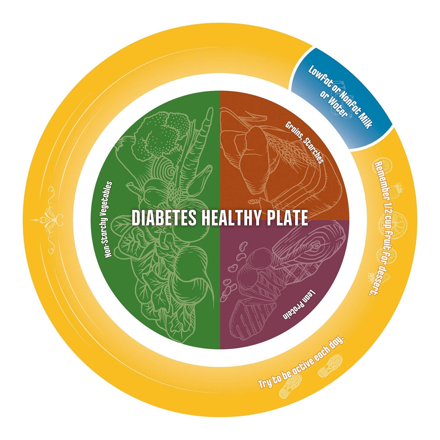
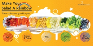
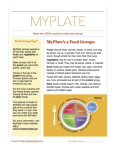
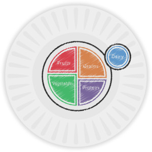
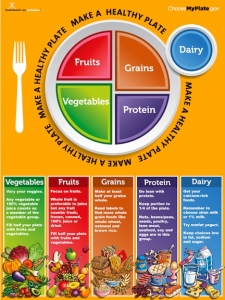
MyPlate is an excellent tool to encourage balanced eating.
For visual learners, having an image of MyPlate is a great starting point on the road to healthful eating habits. You can take this image even farther in an interactive project. Not only will this project help cement the basics of MyPlate in the minds of your visual learners, but it will also draw in your kinetic learners as well. Almost everyone can benefit from learning by doing!
So, what’s the project? Making a physical MyPlate plate.
There are a bunch of ways to approach this, but I want to point you toward a few of my favorite styles…
 Approach #1: Color a Paper Plate
This one is pretty self-explanatory. Display an image of MyPlate and walk your clients through the basics of how and why the plate is divided. After that, you can distribute paper plates to each of your participants and let them create their own MyPlate plates with crayons or markers. They can draw their designs right on the plate!
Be sure to choose crayons or markers that are safe for kids — these won’t have harmful chemicals that could be dangerous to ingest. Not that a lot of anything would transfer from the plate to the food placed on it, but it’s best to play it safe.
If you’re distributing food as part of the activity, have people use their plates to portion out what they eat. They may want to make several MyPlate plates so that they can use the guide a few times. After all, paper plates don’t last past one meal.
Materials needed: A MyPlate image example, paper plates, and markers or crayons
 Approach #2: Create Melamine Plates
To help your clients make MyPlate plates that they can use again and again, create melamine plates. These plates are embedded with the images that people draw, and they’re reusable. In fact, they can be treated just like regular plates — without fear of flaking, fading, or general destruction.
To create these plates, you’ll need a Make-A-Plate Kit with specialized markers. Hand out the plate papers from the kit to your clients after your discussion of MyPlate, and then let them use the markers to create their own MyPlate images.
This is a relatively inexpensive project that produces long-lasting results.
There is one thing to be aware of, however, and that is production delays. It often takes 2-3 weeks to return the MyPlate drawings as physical plates, so be sure to plan for this holdup.
Materials needed: A MyPlate image example, melamine plate kits, melamine plate markers, materials for shipping the plates
Approach #3: Paint Pottery Plates
For more immediate results and a long-lasting plate, there’s always painting pottery. Yes, this is a generally more expensive and involved approach than the other two, but it also often produces beautiful results. You can turn the project into a festive outing or party, and it makes a great end-of-session finale.
Hanging a MyPlate poster or enlarged drawing in the studio can help inspire your participants as they work. It also offers a great example to guide their painting.
Materials needed: MyPlate image example, a pottery studio, potted plates, paints and brushes
 Details: Creating the Plates
Now that we’ve discussed a few general ways for your clients to make their own MyPlate plates, let’s get into the specifics of plate creation.
Make sure that there is an image of MyPlate available for your participants to look at as they create their plates. After all, the goal is to have an accurate guide to balanced eating available for their reference. A MyPlate with the wrong proportions on it is not helpful.
Now, when it comes to drawing the plate within the guidelines set forth by the USDA, there is plenty of room for innovation.
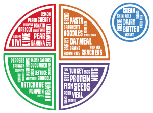
Yes, clients could copy the MyPlate image exactly “as is” from the USDA website, but they could also innovate when it comes to decorating the plates. For example, some participants could use pictures to highlight what goes in each section, drawing images of their favorite foods from each food group. Or each section of MyPlate could become a word cloud (as pictured here). This word cloud can also feature the foods that fit into each food group.
The possibilities are endless!
Examples, Giveaways, Prizes, Shortcuts, or Take-Home Ideas for Clients
Of course, if you’re looking for examples, giveaways, prizes, shortcuts, or take-home ideas for clients, then you need look no further than the Nutrition Education Store. At the store, you can purchase…
These are wonderful examples that people can pass around while they create their own MyPlate plates. The plates also make perfect prizes for giveaways and can be distributed as take-home ideas for clients. Plus, if you don’t have the time, budget, or resources to have participants make their own plates, these plates offer a fantastic shortcut.
So. There you have it. A bunch of ideas for a great MyPlate project. Enjoy!
By Judy Doherty, PC II and Founder of Food and Health Communications, Inc
There’s always more in the store. Check out these fantastic MyPlate resources!
MyPlate Poster
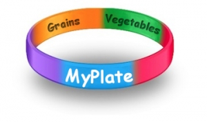
MyPlate Wristbands
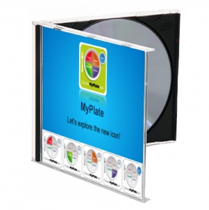
MyPlate PowerPoint Presentation

MyPlate Handout for Kids
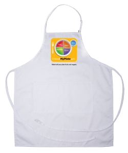
MyPlate Apron